PBR materials in architecture are surface definitions built on physically based rendering, where measured values for color, roughness, and reflectance tell the render engine how light actually behaves on glass, metal, concrete, and other building finishes. This approach produces consistent, photoreal results across different lighting conditions because every map is grounded in real-world physics rather than guesswork.
Getting PBR materials right is what separates a flat, plastic-looking facade from one that reads as real aluminum or laminated glass. The challenge for architects is that a single material is rarely one image. It is a stack of texture maps working together, plus calibrated numeric values that most modeling tools expose in slightly different ways. This guide breaks down the map types, walks through glass, aluminum, and wall panel setups, covers Revit material handling, and points to reliable texture libraries you can pull from today.
What Are PBR Materials in Architecture?
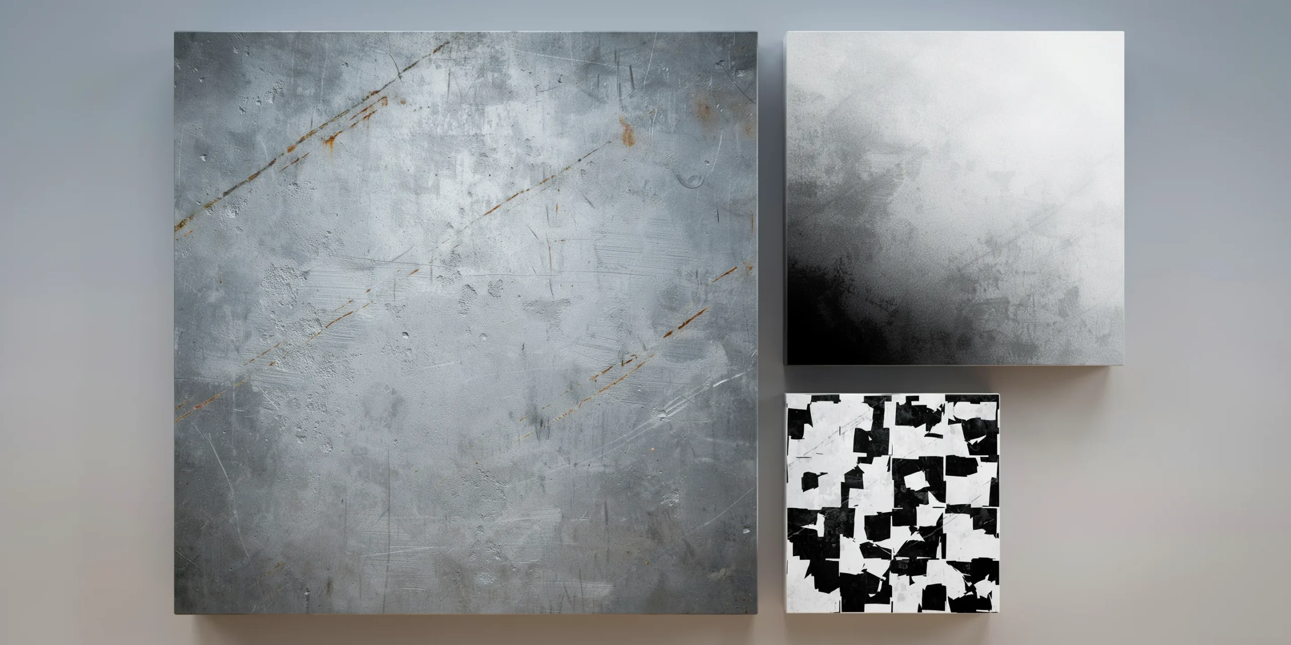
PBR materials in architecture describe surfaces using a set of texture maps and physical parameters that follow real optical behavior. Instead of faking a shiny floor with a single glossy color, a PBR material defines base color, how rough the surface is, whether it is metal or not, and how its micro-detail catches light. Render engines like Chaos V-Ray, Lumion, and Enscape read these inputs the same way, so a calibrated material looks correct under a bright noon sun or a soft overcast sky.
According to the Chaos guide on physically based rendering, a PBR material is typically built from albedo (base color), roughness, metalness, and normal data, with optional height, ambient occlusion, opacity, and refraction maps for more complex surfaces. The energy-conserving math behind these maps means a surface never reflects more light than it receives, which is exactly why PBR materials look believable where older specular-and-gloss setups often did not.
📐 Technical Note
Two PBR conventions exist: metallic/roughness and specular/glossiness. Most architectural pipelines, including those in Adobe Substance and Unreal-based engines, default to metallic/roughness because it uses fewer maps and is harder to break. When you download a texture set, check the map names so you load roughness into the roughness slot rather than a gloss map, which is its inverse.
Which Texture Maps Define a PBR Material?
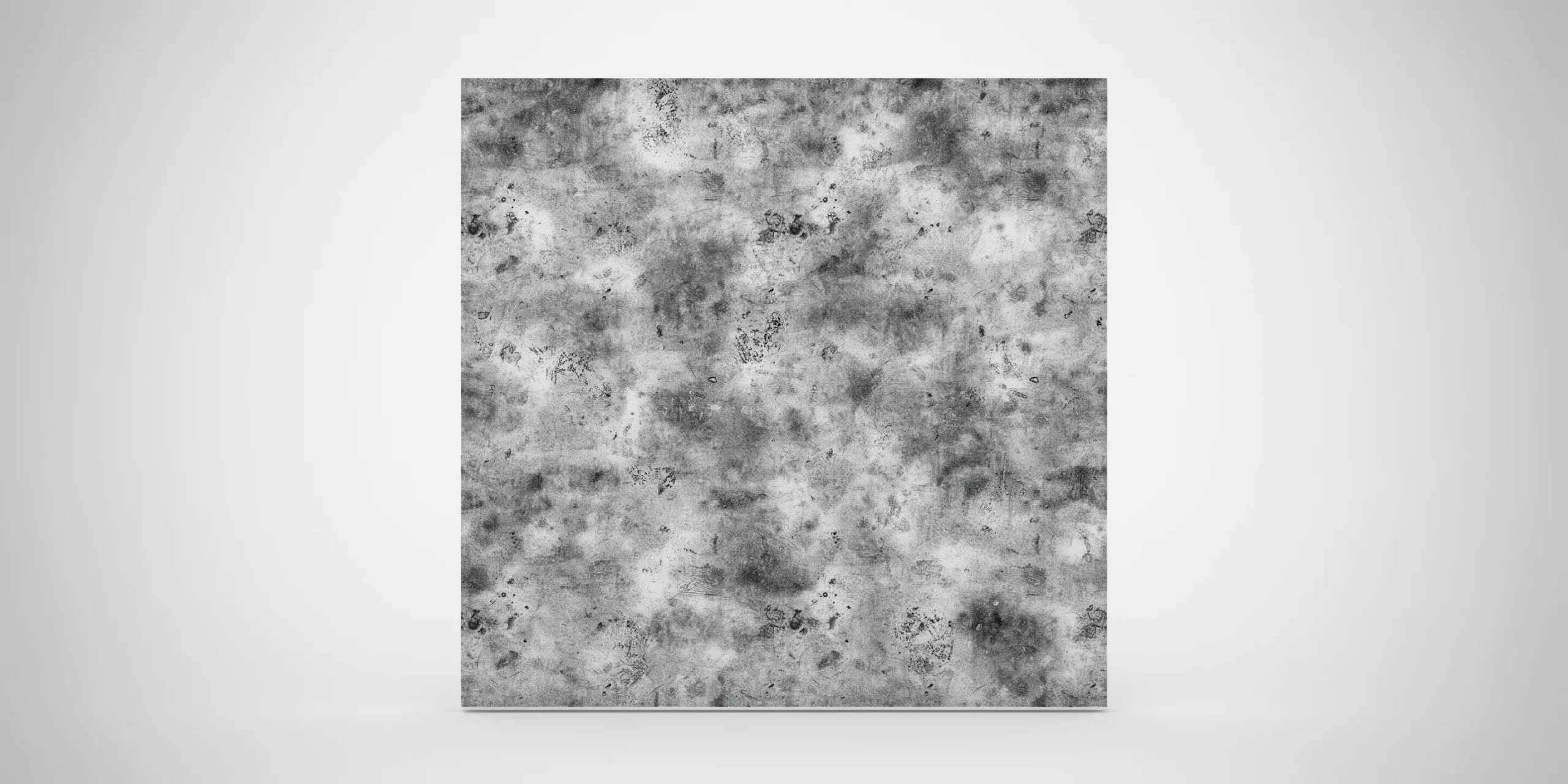

Each map controls one physical property, and they stack to form the final surface. You will not always use every map. A smooth painted wall might need only base color and roughness, while a weathered stone facade benefits from the full set including height and ambient occlusion. The table below covers the maps you will see most often in architectural texture libraries.
Common PBR Texture Maps and What They Control
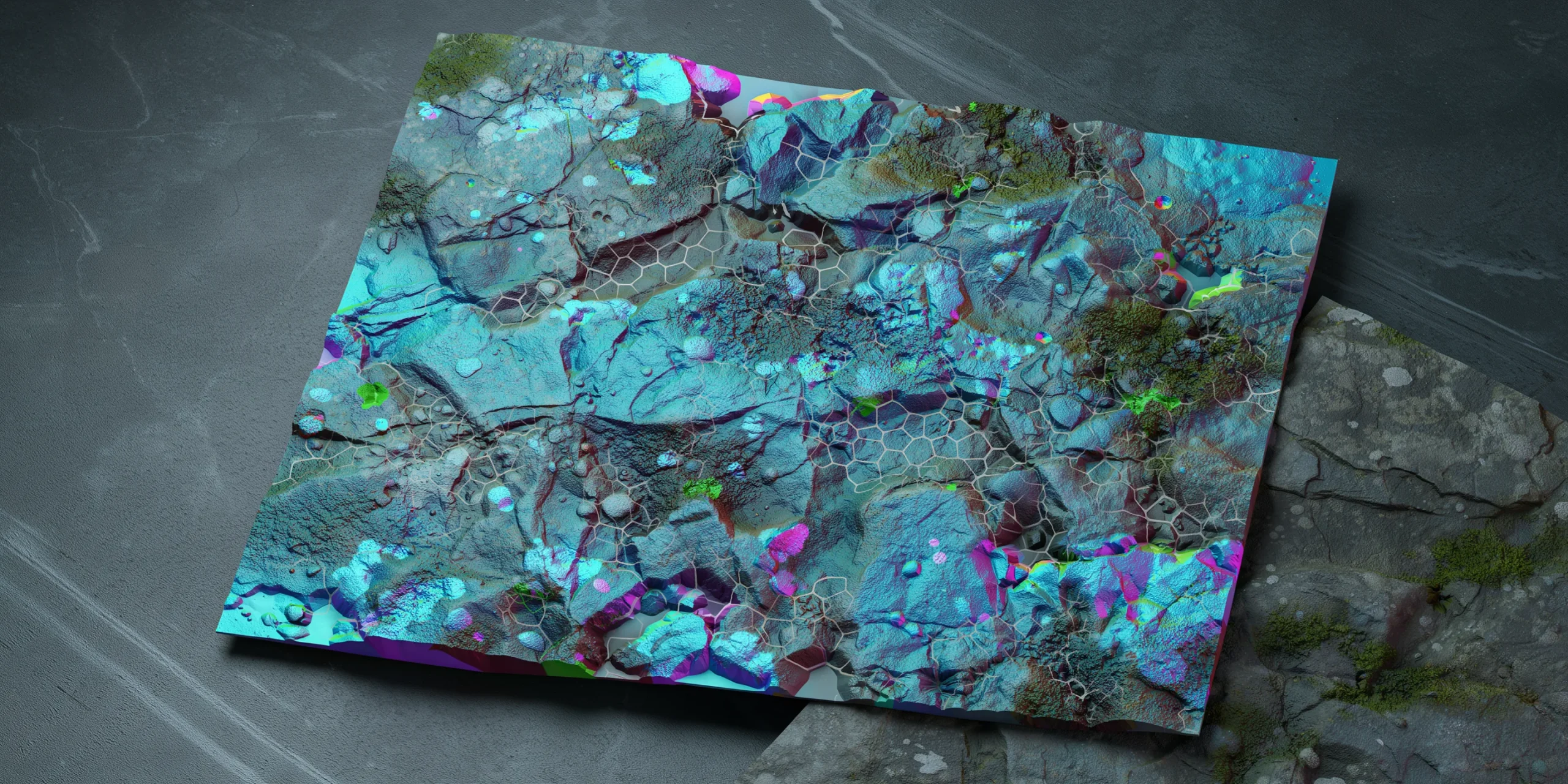
| Map | Controls | Typical Use |
|---|---|---|
| Base color / Albedo | Raw surface color with no lighting baked in | Every material |
| Roughness | How sharp or blurred reflections are | Glass, metal, polished stone |
| Metallic | Whether a surface reads as raw metal | Aluminum, steel, brass cladding |
| Normal | Fine surface relief without extra geometry | Brick, panel seams, brushed metal |
| Height / Displacement | Real depth carved into the mesh | Deep stone, recessed wall panels |
| Ambient occlusion | Soft contact shadow in crevices | Textured walls, joints, grout lines |
| Opacity / Refraction | Transparency and light bending | Glass, water, perforated screens |
One detail that trips up new artists involves color space. Base color and any color-carrying map should be tagged sRGB, while roughness, metallic, normal, and height maps are data maps and must be read as linear (non-color). Loading a roughness map as sRGB shifts its values and gives you reflections that look too sharp or too muddy. This rule holds across V-Ray, Lumion, and game engines alike.
⚠️ Common Mistake to Avoid
Baking lighting or shadows into the base color map is a frequent error carried over from older texturing habits. A PBR base color should be a flat, evenly lit swatch with no highlights or dark corners. Any pre-baked shadow will fight the render engine’s own lighting and make the surface look dirty under direct sun. Let ambient occlusion and the lighting setup do that work.
How to Set Up Glass, Aluminum, and Wall Panel Materials
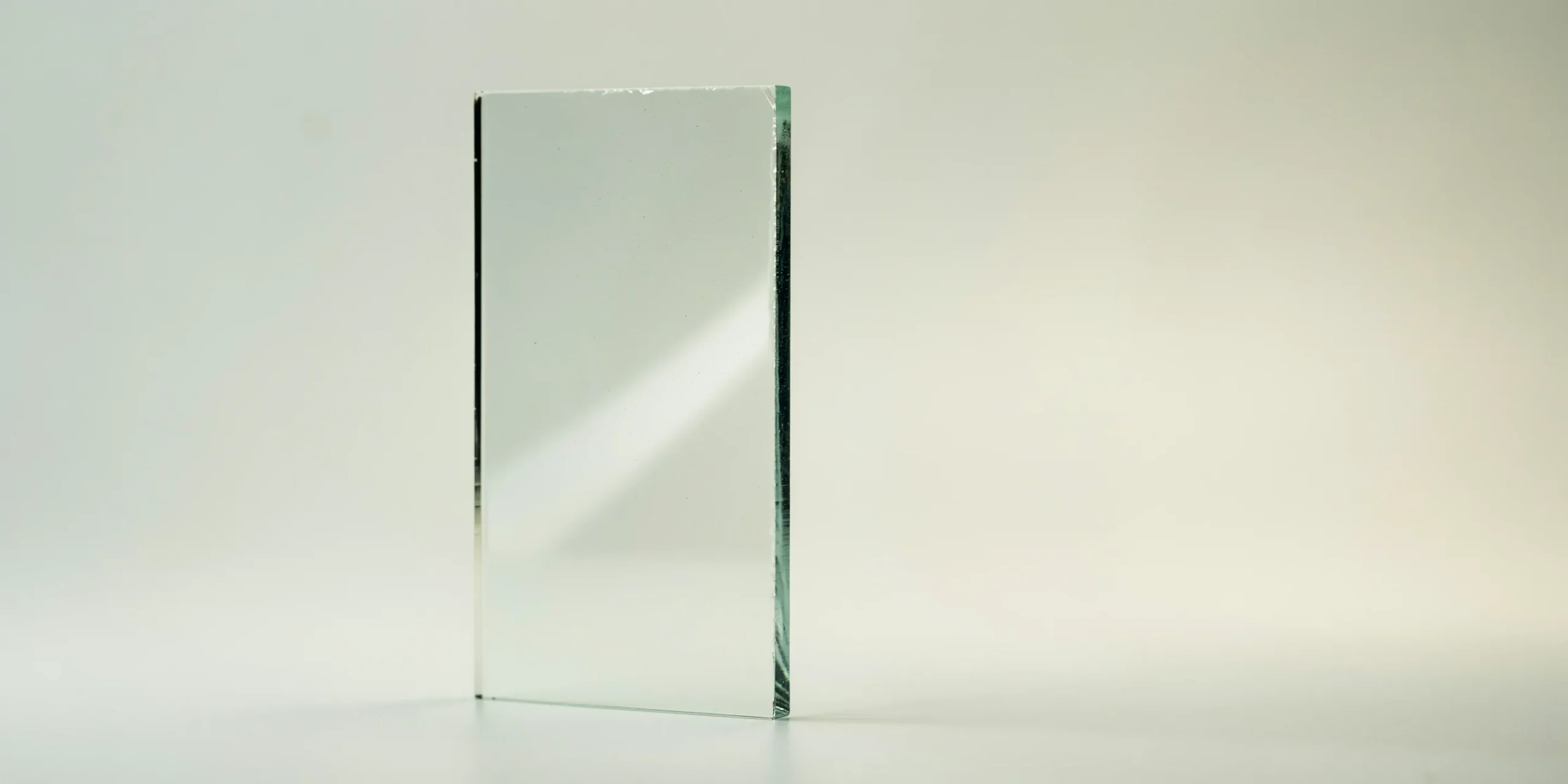
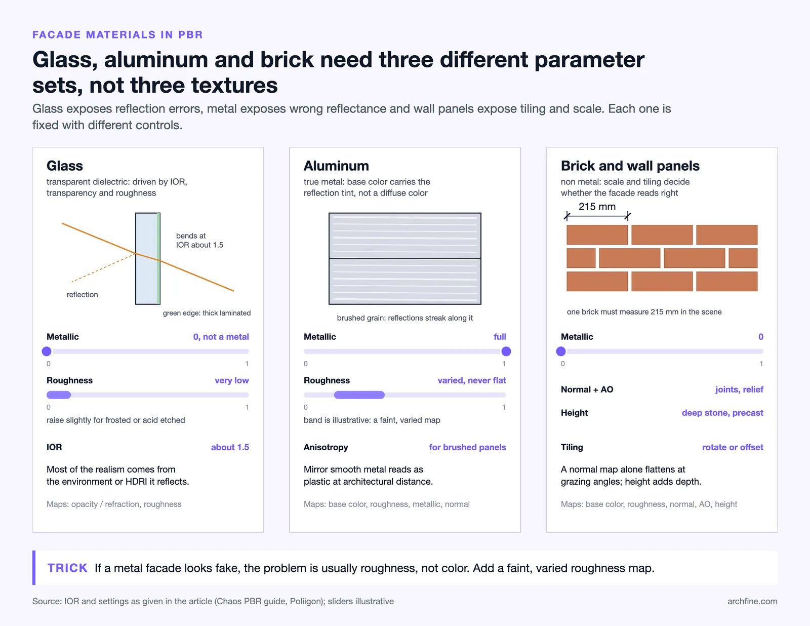
The three finishes that show up on almost every contemporary facade also happen to be the three that reveal weak material work fastest. Glass exposes reflection errors, metal exposes wrong reflectance values, and wall panels expose tiling and scale problems. Here is how to approach each one.
Glass Curtain Walls and Windows
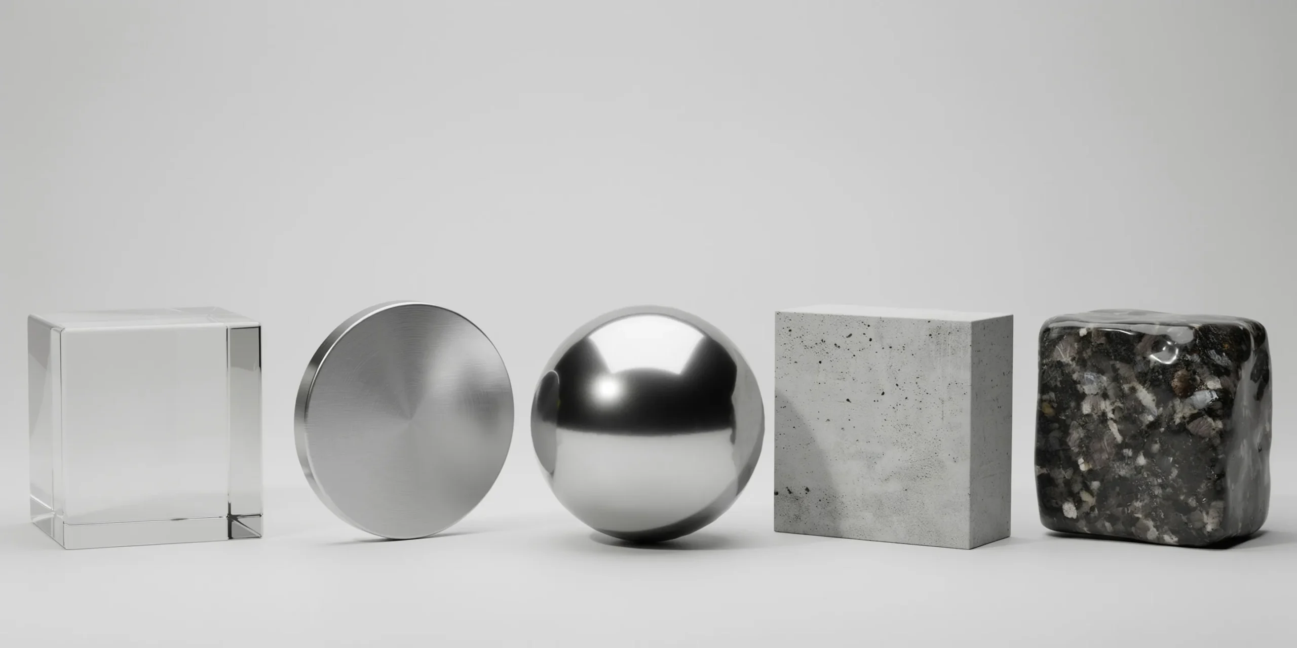
Architectural glass is a transparent dielectric, so it is driven by transparency, roughness, and an index of refraction (IOR) rather than a metallic value. Standard architectural glass sits at an IOR of roughly 1.5. Keep roughness very low for clean float glass and raise it slightly for frosted or acid-etched panels. A small amount of reflection tint, plus a subtle green edge for thick laminated glass, sells the realism. For curtain walls, the reflections of the surrounding context matter more than the glass itself, so a good environment or HDRI does most of the heavy lifting.
Aluminum and Metal Cladding
Aluminum is a true metal, so its metallic value should be set to full and its base color carries the actual reflection tint rather than a diffuse color. Brushed and anisotropic aluminum panels need a directional normal or anisotropy map so reflections streak along the grain the way real milled metal does. Calibrated texture sets, such as the milled aluminum materials from Poliigon, ship base color, roughness, metallic, normal, and height maps tuned to realistic aluminum luminance, which saves hours of trial and error.
💡 Pro Tip
When a metal facade looks fake, the problem is usually roughness, not color. Pure mirror-smooth metal reads as plastic at architectural distance. Add a faint, varied roughness map so the panel breaks reflections up slightly across its surface. Real anodized aluminum is never a perfect mirror, and that tiny imperfection is what makes the render convincing.
Wall Panels, Brick, and Stone
Wall finishes are non-metallic surfaces where scale and tiling decide the outcome. Set the metallic value to zero and rely on base color, roughness, normal, and ambient occlusion. The single most important step is real-world scale: a brick that should be 215 mm long must measure that in your scene, or the whole facade reads wrong. Use seamless, high-resolution panel textures and rotate or offset tiles to break visible repetition on large surfaces. Height or displacement maps add genuine depth to deep stone or precast panels where a normal map alone would flatten at grazing angles.
🔢 Quick Numbers
- Architectural glass index of refraction: about 1.5, per Chaos and standard optical references
- Revit non-metal reflectance: 0.00 to 0.08, with 0.04 sufficient for most surfaces, per Autodesk material documentation
- Revit metal reflectance: fixed at 100% and not editable, per Autodesk material documentation
How Do Revit Materials Handle PBR?
Revit introduced physically accurate materials in its 2019 release, and the appearance assets you edit in the Asset Browser are PBR materials under the hood. Autodesk documentation groups them into metal, non-metal, transparent, and layered categories, each exposing the standard albedo, roughness, and bump or normal inputs you would expect. The base materials in the Appearance Library are a good starting point because their reflectance values are already calibrated to physical ranges.

The split between metal and non-metal in Revit mirrors the metallic/roughness logic above. Metal assets carry fixed 100% reflectance, while non-metal assets use a reflectance between 0 and 8 percent, with 0.04 working for most painted and stone surfaces. Transparent assets swap reflectance for an absorption distance and an index of refraction, which is the correct model for glass. When you build custom materials, Autodesk advises avoiding pure black, pure white, or oversaturated colors in the albedo and keeping bump and normal maps in linear color space. If you later push Revit views into an AI rendering pass, those calibrated materials still guide how the visualization tool interprets each surface, which is worth keeping in mind when planning an AI rendering workflow from a BIM model.
Where to Find Reliable PBR Texture Libraries
You do not need to author every map by hand. Several libraries publish calibrated, seamless PBR sets aimed at architectural work, ranging from free to subscription based. Poliigon offers large catalogs of metal panel, wall, and cladding textures with full map sets. Adobe Substance provides procedural materials that adapt to any scale and tie directly into a Revit-to-render workflow. Free sources such as 3DTextures.me cover brick, concrete, and glass for Blender, Unreal, and similar engines. The key habit is to confirm a set includes the maps your engine expects before downloading, and to verify the texture resolution suits the distance the surface will be viewed from.
Material quality is only one of several factors that lift a render from passable to professional. Lighting, composition, and post-processing carry just as much weight, a point covered in this breakdown of the key elements of a great architectural render. The level of material precision you need also depends on intent: a final client deliverable demands fully calibrated PBR materials, while an early concept may be served faster by a looser approach, as explored in this comparison of photorealistic versus stylized renders. If you work mainly in SketchUp, the same material thinking carries into a SketchUp AI rendering pipeline.
Frequently Asked Questions
What is the difference between PBR and traditional materials?
Traditional materials rely on artist-tuned diffuse, specular, and gloss values that often need re-tweaking for each lighting setup. PBR materials use physically measured inputs and energy-conserving math, so the same material looks correct across different lights without manual adjustment. That consistency is the main reason architectural pipelines moved to PBR.
Do I need every PBR map for each material?
No. A smooth painted wall may need only base color and roughness, while a weathered stone facade benefits from normal, height, and ambient occlusion too. Start with base color, roughness, and metallic, then add maps only where the surface actually shows that detail.
How do I make glass look realistic in a render?
Use a transparent material with an index of refraction near 1.5, keep roughness low for clear glass, and give it a strong environment or HDRI to reflect. Most of what makes glass convincing is the surrounding context it mirrors, not the glass settings themselves.
Why does my aluminum look like plastic?
Almost always because the metallic value is not set to full, or the roughness is a flat single value. Set metallic to full, let the base color carry the reflection tint, and add a subtle varied roughness map so the surface breaks reflections the way real anodized aluminum does.
Putting It All Together
✅ Key Takeaways
- PBR materials stack base color, roughness, metallic, and normal maps with calibrated values so surfaces stay accurate under any lighting.
- Tag base color as sRGB and roughness, metallic, normal, and height maps as linear, or reflections will read wrong.
- Glass uses transparency and IOR near 1.5, aluminum needs full metallic with varied roughness, and wall panels depend on correct real-world scale.
- Revit’s metal, non-metal, and transparent assets are PBR materials with reflectance values you can trust as a starting point.
- Calibrated libraries like Poliigon, Adobe Substance, and free PBR sources save time, provided you confirm the maps match your engine.
Strong material work rewards patience more than software. Once you build a small library of calibrated glass, metal, and wall materials you trust, every future project starts further ahead, and your renders stop looking like assembled assets and start looking like buildings. For deeper reference, the official Chaos guide to physically based rendering, the Lumion PBR material workflow, Autodesk’s material documentation for Revit, and texture sets from Poliigon are all worth keeping close.