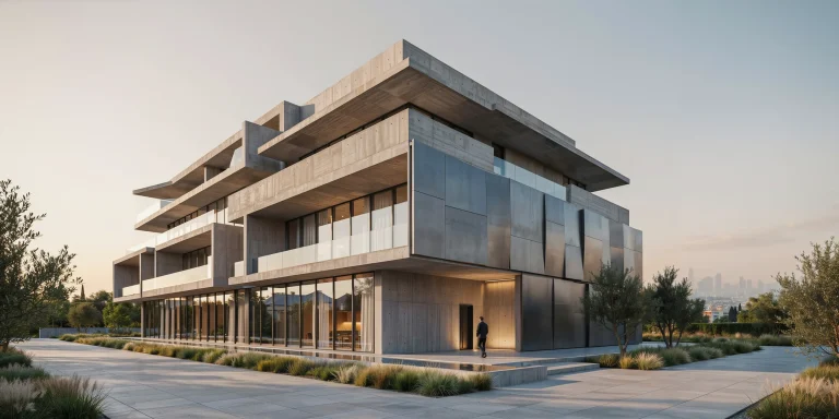
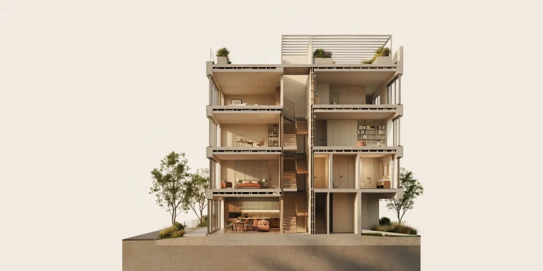
Photorealistic rendering is the process of producing architectural images so convincing they read as photographs, achieved by correctly simulating how light, materials, and the camera behave in the real world. The believability of a render rarely comes from one feature. It comes from controlling lighting, physically based materials, and composition together until none of them gives the illusion away.
What makes a render photorealistic?

A render becomes photorealistic when every visual cue the eye uses to detect a fake is removed. In photorealistic rendering, light has to bounce, falloff has to be physically correct, surfaces need accurate reflectance and roughness, and the framing has to mimic how a real photographer would shoot the space. Miss any one of these and the image tips into the uncanny zone, where it looks expensive but still wrong.
This is a technique guide focused on the how. If you are still deciding whether photoreal is even the right look for your project, our breakdown of photorealistic vs stylized renders covers when each approach wins clients faster. Here we assume you have committed to realism and want a repeatable workflow to get there.
Throughout, the same principles apply whether you render in V-Ray, Corona, D5, Lumion, Enscape, or an AI engine. The software changes; the physics of believable light and material do not.
📌 Did You Know?
Most viewers judge whether an architectural image is real within the first second, and lighting is the signal they read first. Chaos, the developer of V-Ray and Corona, treats global illumination and accurate light behavior as what separates a believable render from a flat one, which is why lighting is handled as the foundation of photorealism rather than a finishing step.
What Does Photorealistic Actually Mean?
Photorealistic means indistinguishable from a photograph, and the word carries two histories that get mixed up.
The first is the art movement. Photorealism emerged in the United States in the late 1960s, with painters working from photographs to produce canvases that reproduced photographic detail, including the distortions and focus falloff a camera introduces. The point was never realism in the older sense; it was fidelity to the photograph specifically.
The second is the computer graphics usage, which inherited the word and narrowed it. In rendering, photorealistic means the image obeys the physics a camera obeys: light behaves correctly, materials respond correctly, and the exposure is a camera exposure rather than an arbitrary brightness.
That distinction matters in practice. An image can be extremely detailed and not photorealistic, because the failure is usually in light transport or in camera behaviour rather than in resolution. It is also why adding detail rarely rescues an image that reads as fake.
📐 Technical Note
The camera is where most renders fail, not the materials. Exposure, white balance, focal length and depth of field are what make an image read as photographed, and they are set on the physical camera rather than in the scene. A physically correct scene shot with a default camera still looks like a render.
Photorealistic, Hyperreal or Stylised?
Three terms used loosely and worth separating, because they describe different targets.
| Target | What it aims at | Typical failure | Right stage |
|---|---|---|---|
| Photorealistic | Indistinguishable from a photograph | Too clean to be real | Technical design onward |
| Hyperreal | Better than a photograph, idealised | Reads as advertising | Marketing and launch |
| Stylised | Deliberately not photographic | Mistaken for unfinished work | Concept and early design |
Most architectural work sits in the first row and drifts into the second without meaning to. Perfect skies, immaculate landscaping and surfaces with no wear are hyperreal rather than photorealistic, and they are the reason so many renders read as renders. The full set of options is covered in our guide to architectural rendering styles.
💡 Pro Tip
To test whether an image is photorealistic or merely detailed, convert it to greyscale and look at the tonal range. A photograph has a full range with detail in both the shadows and the highlights; a render that fails usually has crushed shadows or blown highlights, which is an exposure problem visible in the film and exposure settings rather than a material one.
Is Photorealism Always the Right Target?
No, and treating it as the default is the most common strategic error in architectural visualisation.
A photoreal image claims certainty. It states the material, the light and the season, and a client reads all three as decisions. At concept stage those decisions have not been made, so the image is claiming more than the design can support.
It costs the most. Physically correct light, real material data and camera-accurate exposure take the longest to set up and the longest to render, which is rarely justified for an image whose job is to test a massing option.
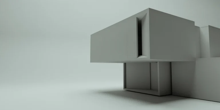
Clay renders answer earlier questions better. With no material to fixate on, a clay render puts the conversation on form and light, which is where it belongs before the palette is settled.
The rule that holds: choose photorealism when the material is specified and the image has to be held to what will be built. Before that point it is an expensive way to invent decisions.
The photorealistic rendering checklist

Before diving into each discipline, here is the realism checklist experienced archviz artists run through on every shot. Treat it as a pre-flight list, not a one-time setup.
- Lighting: one dominant source, correct color temperature, soft and grounded shadows, global illumination enabled.
- Materials: PBR maps on every surface, realistic roughness variation, no perfectly clean or perfectly flat textures.
- Scale: models built in real-world units so reflections and depth of field read correctly.
- Composition: camera at eye level, sensible focal length, intentional framing.
- Context: sky, vegetation, and environment that match the lighting direction and time of day.
- Post: subtle color grade, light glare, and grain that mimic a real camera sensor.
How do you light a render for realism?

You light a render for realism by establishing one dominant light source, letting global illumination carry the bounce, and keeping every value physically consistent. Real spaces are almost never lit evenly, so your render should not be either. A single sun or a single large window doing most of the work, with everything else as fill, reads instantly as authentic.
For exteriors, drive the scene with a sun and sky system and run a quick sun study to find the angle that flatters the form. Low, raking afternoon light creates long shadows that describe depth and texture far better than harsh noon light. For interiors, treat windows as the primary source and let global illumination bounce that daylight around the room rather than scattering dozens of artificial lights to brute-force brightness.
An HDRI environment map is the fastest way to get convincing ambient light and realistic reflections at once, because it surrounds the scene with real-world luminance captured from an actual location. Pair it with physically correct exposure so highlights roll off naturally instead of clipping to pure white.
💡 Pro Tip
When an interior feels flat, do not add more lights. Lower your overall exposure first, then let a single window source carry the scene. Most beginner renders look fake because they are over-lit, not under-lit. Crushing the fill light back until shadows return gives you the contrast real photography depends on.
Whichever engine you use, keep shadow softness tied to source size. Large sources like an overcast sky or a frosted window produce soft, gradual shadows; small sources like a spotlight produce hard edges. Matching shadow softness to source size is one of the quietest but most powerful realism cues. For a wider view of why lighting outranks every other factor, see our guide on what makes a great architectural render.
Getting materials right with PBR

Physically based rendering, or PBR, is the material standard behind every modern photorealistic engine. Instead of guessing at shine and color, PBR materials describe a surface through measurable properties so it responds correctly to any lighting you place it in. Get the inputs right and a material that looks correct in daylight will still look correct at dusk without manual tweaking.
A complete PBR material is built from a small set of texture maps working together. Knowing what each one controls is what lets you fix a material that looks plasticky or dull.
| Map | What it controls | Realism impact |
|---|---|---|
| Albedo / Base Color | The pure surface color with no lighting baked in | Wrong albedo makes everything else read as fake |
| Roughness | How sharp or blurry reflections appear | The single biggest cue for material believability |
| Normal / Bump | Fine surface detail without added geometry | Adds grain, weave, and tactile depth |
| Displacement | Real geometric height for deep relief | Critical for brick, stone, and cobblestone edges |
| Metalness | Whether a surface is metal or dielectric | Controls reflection tint and intensity |
The most common realism killer is uniform roughness. Real surfaces are never evenly shiny: a countertop has fingerprints, a floor has wear paths, glass has faint smudges. Adding a roughness map with subtle variation, even a low-contrast grunge texture, instantly breaks the sterile CG look. Reflection is where believability lives, so spend your time there before tweaking color.
⚠️ Common Mistake to Avoid
Avoid using raw albedo textures that already contain baked-in shadows or highlights. A brick texture photographed in direct sun carries lighting information that fights your scene lighting, producing a flat, double-lit look. Always use de-lit or scanned PBR albedo maps so your render engine, not the texture, decides how light falls.
📐 Technical Note
PBR workflows follow one of two conventions: metalness/roughness or specular/glossiness. Most architectural pipelines (V-Ray, Corona, D5, and Unreal-based engines like Twinmotion) standardize on metalness/roughness. Keep your texture set consistent with the engine’s expected convention, because mixing them inverts roughness and produces mirror-like surfaces where you wanted matte ones.
Composition and camera: shooting like a photographer

Even flawless lighting and materials fall apart with a careless camera. Photorealistic rendering means imitating real photography, and real photographers obey a small set of rules. Set your camera to a human eye level, around 1.6 meters, unless the shot deliberately calls for something else. Cameras placed at arbitrary heights are an instant tell that an image was rendered, not photographed.
Focal length matters as much as position. Architectural photographers favor lenses in the 24mm to 35mm range for interiors and wider equivalents for exteriors, and crucially they keep vertical lines vertical. Two-point perspective, where verticals stay parallel rather than converging, is the convention that makes a building look professionally shot. Most engines offer a tilt-shift or vertical-correction toggle for exactly this.
Use the rule of thirds and leading lines to guide the eye toward the hero of the scene. A hallway, a staircase, or a row of columns can carry the viewer straight to the focal point. Leave breathing room; cramped framing feels amateur, while a composition with intentional negative space feels considered.
🏗️ Real-World Example
Therme Vals (Vals, 1996): Peter Zumthor’s stone baths are a favorite archviz study because their realism depends almost entirely on light and material, not ornament. Recreating the space teaches the core lesson of photorealism: convincing stone roughness and a single shaft of daylight do more for believability than any amount of added geometry.
Context and post-processing
A building floating in a void never looks real. Ground it with context that matches your lighting: vegetation casting shadows in the same direction as the sun, a sky whose color temperature agrees with the time of day, and entourage like people, cars, or furniture that establish scale. The environment is not decoration; it is the reference frame the eye uses to accept the structure as physical.
Post-processing is where a clean render becomes a photograph. Keep it subtle. A gentle color grade, a slight S-curve for contrast, a touch of bloom on bright highlights, mild chromatic aberration at the frame edges, and a fine layer of grain all replicate the imperfections of a real camera sensor. The goal is to add the flaws photography naturally has, not to over-stylize. If a viewer notices the post, you have gone too far.
AI rendering engines compress much of this pipeline by inferring lighting, materials, and atmosphere from a simple model or sketch in seconds. They are excellent for fast concept iterations, though traditional physically based engines still own final, regulation-grade deliverables. If you want to fold AI into your realism workflow, our practical walkthrough on how to use AI to render architecture shows where it fits, and the SketchUp AI rendering guide covers a model-to-photoreal route many designers start with.
Common mistakes that break photorealism
- Over-lighting. Flooding a scene with fill light erases the shadows that signal depth and reality.
- Perfectly clean surfaces. Spotless, dust-free, wear-free materials read as CG. Real surfaces age.
- Uniform roughness. A single roughness value across a material removes the reflection variation eyes expect.
- Wrong camera height. Floor-level or ceiling-level cameras betray the render unless intentional.
- Converging verticals. Tilted walls look snapshot-amateur; correct them for a professional shot.
- Mismatched context. A sunny sky over shadows pointing the wrong way breaks the illusion instantly.
💡 Pro Tip
Before final render, view your scene in black and white. Stripping color forces you to judge the lighting and tonal range on their own. If the grayscale image already reads as a believable photograph, color and materials will only strengthen it. If it looks flat in mono, no amount of texture work will save it.
Frequently asked questions
How long does a photorealistic render take?
A still image from a traditional engine like V-Ray or Corona can take from several minutes to a few hours per frame depending on resolution, lighting complexity, and hardware. Real-time engines such as D5 and Lumion shorten this dramatically, and AI rendering tools can output a photoreal image in seconds, which is why many studios now iterate with AI and finalize with a physically based engine.
Which is the most important factor in photorealistic rendering?
Lighting. It is consistently cited as the single most influential factor in whether a render reads as real, because it governs shadows, reflections, mood, and how every material is perceived. Materials and composition matter, but they sit on top of a correctly lit scene. Fix lighting first and the rest becomes far easier.
Do I need expensive software for photorealistic rendering?
No. The principles in this guide, physically correct lighting, PBR materials, and photographic composition, apply across every price tier. Free and subscription engines, real-time tools, and AI platforms can all reach photorealism. Skill in lighting and material setup outweighs the specific software far more often than beginners expect.
Putting the workflow into practice
Photorealistic rendering is less about owning the right plugin and more about respecting how light, surfaces, and the camera actually behave. Start every scene with a single dominant light, build materials from honest PBR maps with varied roughness, frame the shot like a photographer would, and finish with restrained post. Run the realism checklist on each image and treat the common mistakes list as a final audit. Do that consistently and the leap from convincing to indistinguishable stops being luck and becomes a process you can repeat on demand.
External references: Chaos (V-Ray and Corona) rendering techniques, D5 Render real-time engine, Autodesk 3ds Max, and ArchDaily for architectural photography reference.