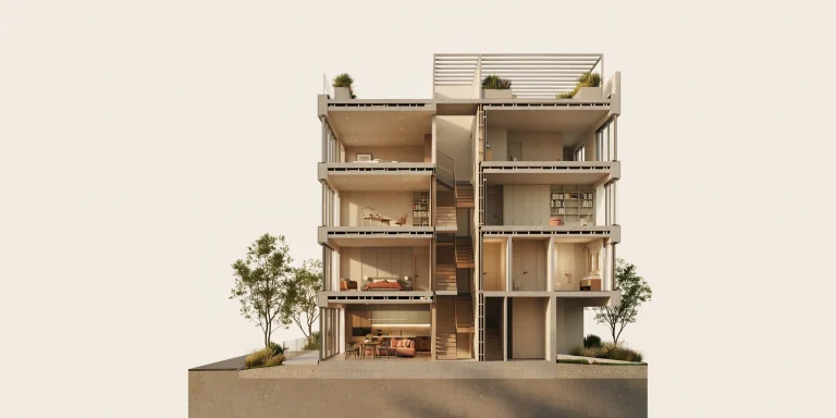
A white model render is an architectural visualization in which every surface is replaced with a single neutral grey or white material, so the image reads as pure form. Also called a clay render, it strips away color and texture to expose volume, proportion, and shadow. Architects use it for massing studies, early concept reviews, and clean presentation imagery.
Before a project earns its glass, brick, and golden-hour sky, it has to work as geometry. That is where the white model render earns its place. By muting materials down to one neutral shader, you force the eye to judge the architecture on its own terms: how masses stack, how light rakes across a facade, and how voids carve into solids. This guide explains when a white model render outperforms a full photorealistic image, how to set one up in the major engines, and the mistakes that quietly ruin an otherwise clean clay render.
What is a white model render in architecture?

A white model render applies a uniform diffuse material, typically a light neutral grey around 0.6 to 0.8 reflectance, to the entire scene through a global material override. The result resembles a physical study model cast in plaster or clay, which is where the alternate name clay render comes from. Because there is no texture, color, or reflective noise competing for attention, the image communicates one thing only: the shape of the building and how light behaves on it.
The technique mirrors a long architectural tradition. Physical massing models in chipboard, foam, or basswood have always been monochrome on purpose, so a designer reads silhouette and proportion without distraction. The digital white model render is the rendered descendant of that habit. It keeps the analytical honesty of a study model while adding controllable lighting, accurate shadows, and the ability to revise in seconds rather than rebuilding by hand.
📌 Did You Know?
The neutral grey most studios use for clay renders is not pure white. A value near 0.65 linear, roughly #D3D3D3 in sRGB, prevents bright surfaces from blowing out under skylight while keeping shadow detail readable. Pure white tends to clip highlights and flatten the very form the render is meant to reveal.
When should you use a clay render instead of a full render?
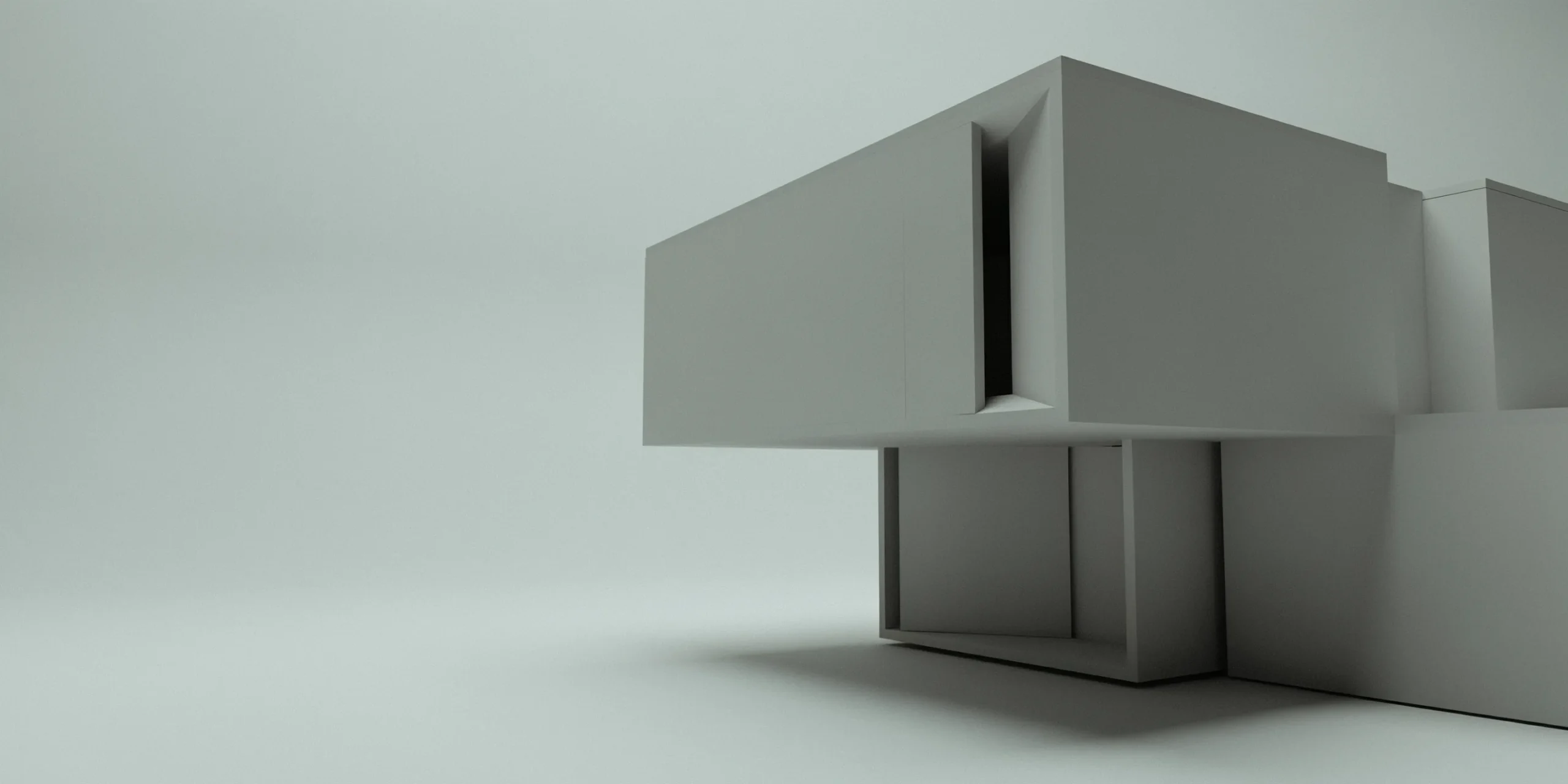
Use a clay render when clarity of form matters more than surface realism. That covers most of the early and middle design phases, plus specific presentation moments where materials would distract from the architectural idea. A full photorealistic render belongs later, once the design is resolved and you need to sell the experience of the finished building. Knowing which job each image is doing keeps your visualization workflow efficient and your client conversations on point.
Massing studies and concept design

Massing is the disciplined study of a building’s overall volume, proportion, and relationship to its site, long before windows or finishes are chosen. At this stage, a designer is concerned with how light strikes surfaces, how shadows fall on the surrounding context, and how solids and voids generate the silhouette. A white model render is the ideal output for this work because it shows exactly those qualities and nothing else. You can swap one massing option for another and compare them on equal footing, with no material bias coloring the decision.
Design reviews and internal iteration

During in-house reviews, speed and revision count more than polish. Clay renders are fast to produce and trivial to update, so a team can test a dozen facade rhythms or roof profiles in an afternoon. A light, controlled amount of ambient occlusion sharpens the reading of recesses and overhangs, helping reviewers grasp depth at a glance. Because nobody is debating whether the brick looks right, the conversation stays where it belongs: on the architecture.
Presentation and competition boards
Clay renders are not only a working tool. A crisp white model render carries a quiet, confident aesthetic that suits zoning meetings, competition panels, and cover images where restraint reads as sophistication. It also avoids committing to material decisions that are not final, which protects you from a client fixating on a placeholder texture. For a deeper look at how visual style shapes client response, see our comparison of photorealistic versus stylized renders.
💡 Pro Tip
When presenting massing options to a planning authority, render each variant from an identical camera, sun angle, and grey value. Reviewers compare forms far more accurately when lighting is held constant, and it signals that your study is rigorous rather than cherry-picked.
When to choose a full photorealistic render instead
A full render takes over once the design is locked and the goal shifts from analysis to persuasion. Final client approvals, marketing material, and sales imagery all need accurate materials, reflections, vegetation, and atmosphere to make a space feel inhabitable. Photorealistic renders excel at building trust and closing deals because they let a client imagine standing inside the finished building. If you are weighing AI tools to accelerate that final stage, our guide on how to use AI to render architecture covers the practical workflow.
📐 Technical Note
Most production engines ship a clay preset built on the override system. V-Ray exposes Material Override with presets including White, Clay, and Dark Clay, where Override Mode can be set to Color, Material, or Preset. Corona uses the Material override field under Render Setup, with options to preserve bump, opacity, and slicer materials so selected effects survive the override.
How to set up a white model render

The core mechanic is the same across engines: a global material override swaps every shader for one neutral grey, while lighting and ambient occlusion do the work of revealing form. The steps below outline a reliable setup that translates across 3ds Max with V-Ray or Corona, Cinema 4D, Blender, SketchUp, and most real-time tools.
- Enable the global material override. In your render settings, turn on the override material slot and assign a neutral grey diffuse shader near 0.65 linear. This replaces all scene materials in one move.
- Exclude what should stay readable. Use the engine’s preserve or exclude option to keep glass transparent, or to retain bump on a key surface if the form depends on it. Most clay renders look best with everything muted, but context geometry like cars or people sometimes reads better excluded.
- Set a soft, directional light. A single sun plus a sky or HDRI dome gives clean shadows that describe the massing. Avoid harsh point lights that introduce hotspots and flatten depth.
- Add controlled ambient occlusion. Light AO darkens corners, edges, and intersections where surfaces meet, which dramatically improves the legibility of recesses and overhangs without making the image look dirty.
- Manage exposure and contrast. Tune exposure so the grey holds detail in both highlight and shadow. The goal is a balanced read of the whole form, not a dramatic chiaroscuro.
- Output useful passes. Render the main beauty pass plus separate AO, normals, and depth passes. These give you flexibility to fine-tune contrast and depth in post without re-rendering.
⚠️ Common Mistake to Avoid
Leaving glass overridden to opaque grey is the most common clay render error. A fully solid building loses the depth cues that windows provide and reads as a blank mass. Use the preserve or exclude option to keep transparency on glazing, or assign a subtle reflective grey so openings still register as openings.
Why is ambient occlusion important in a clay render?
Ambient occlusion is a shading technique that darkens areas where surfaces sit close together, such as inside corners, under overhangs, and at the meeting of two volumes. In a white model render, where there is no material contrast to define edges, AO becomes the primary tool for communicating depth. It is what turns a flat grey silhouette into a legible three-dimensional form. Used with restraint, it reads as natural contact shadow; pushed too far, it looks like grime and undermines the clean aesthetic the clay render exists to deliver.
Because AO responds to geometry rather than light direction, it stays consistent even as you rotate the sun for different times of day. That reliability is one reason massing studies lean on it so heavily. The advice carries over to full renders too, since lighting drives realism in both modes. Our breakdown of what makes a great architectural render expands on how light and shadow anchor a believable image.
Clay render vs full render: a quick comparison
| Factor | White Model / Clay Render | Full Photorealistic Render |
|---|---|---|
| Primary goal | Analyze form and proportion | Sell the finished experience |
| Best project phase | Concept, massing, design review | Final approval, marketing, sales |
| Materials shown | Single neutral grey override | Accurate textures and reflections |
| Setup and render time | Fast, easy to iterate | Slower, heavier to compute |
| Reads best with | Ambient occlusion and soft sun | Full lighting, vegetation, atmosphere |
| Risk if misused | Looks unfinished to lay clients | Locks in materials too early |
The two formats are not rivals; they are stages of one pipeline. A strong workflow often opens with clay renders to validate the form, then graduates to photorealism once the geometry is committed. The same model can serve both, which is why a clean white model render setup pays dividends later when materials are layered on top. If your final stage runs on SketchUp geometry, our notes on SketchUp AI rendering show how to push the same model toward photoreal output quickly.
Frequently asked questions
Is a white model render the same as a clay render?
Yes, the terms are used interchangeably in architectural visualization. Both describe an image where every surface receives one uniform neutral material so the architecture reads as pure form. Studios sometimes reserve white model for lighter grey values and clay for slightly warmer or darker tones, but technically they share the same override-based workflow.
Can I make a white model render in SketchUp or Blender?
Yes. V-Ray for SketchUp includes a Material Override with built-in clay presets, and Blender achieves the same result by assigning a single grey material to all objects or using a material override in the view layer. Real-time engines like Enscape, D5, and Twinmotion also offer white or clay modes. The principle stays identical regardless of tool: one neutral shader plus controlled lighting and ambient occlusion.
Are clay renders acceptable for client presentations?
For design-literate audiences such as planning boards or competition juries, yes, a clean clay render reads as deliberate and refined. For lay clients expecting to see their finished home, pair the white model render with at least one photorealistic view so they grasp both the form and the lived experience. Context and audience determine whether the restraint helps or confuses.
The white model render remains one of the most honest tools in an architect’s visualization kit precisely because it refuses to flatter. It shows the building as it actually is at that moment, geometry and light with nowhere to hide. Master the override setup early in a project, and you build a habit of judging design on its merits before any material has a chance to do the persuading.