A site analysis diagram records what a site gives a project and what it imposes on it, covering sun path, wind, access, views, noise, topography and context. It is usually a set rather than a single drawing, because layering everything onto one plan produces something nobody can read.
The purpose is not to demonstrate that analysis happened. It is to establish which constraints will actually shape the design, and a good set makes the eventual design decisions look inevitable. A site analysis diagram that leads to no design decision has documented a site rather than analysed it.
Most site analysis in student work fails because it records everything and concludes nothing.
What Belongs in a Site Analysis

Sun path and shading is the constraint that shapes buildings most directly. Where the sun rises and sets across the year, and what neighbouring structures put in shadow, decides orientation and glazing before anything else.
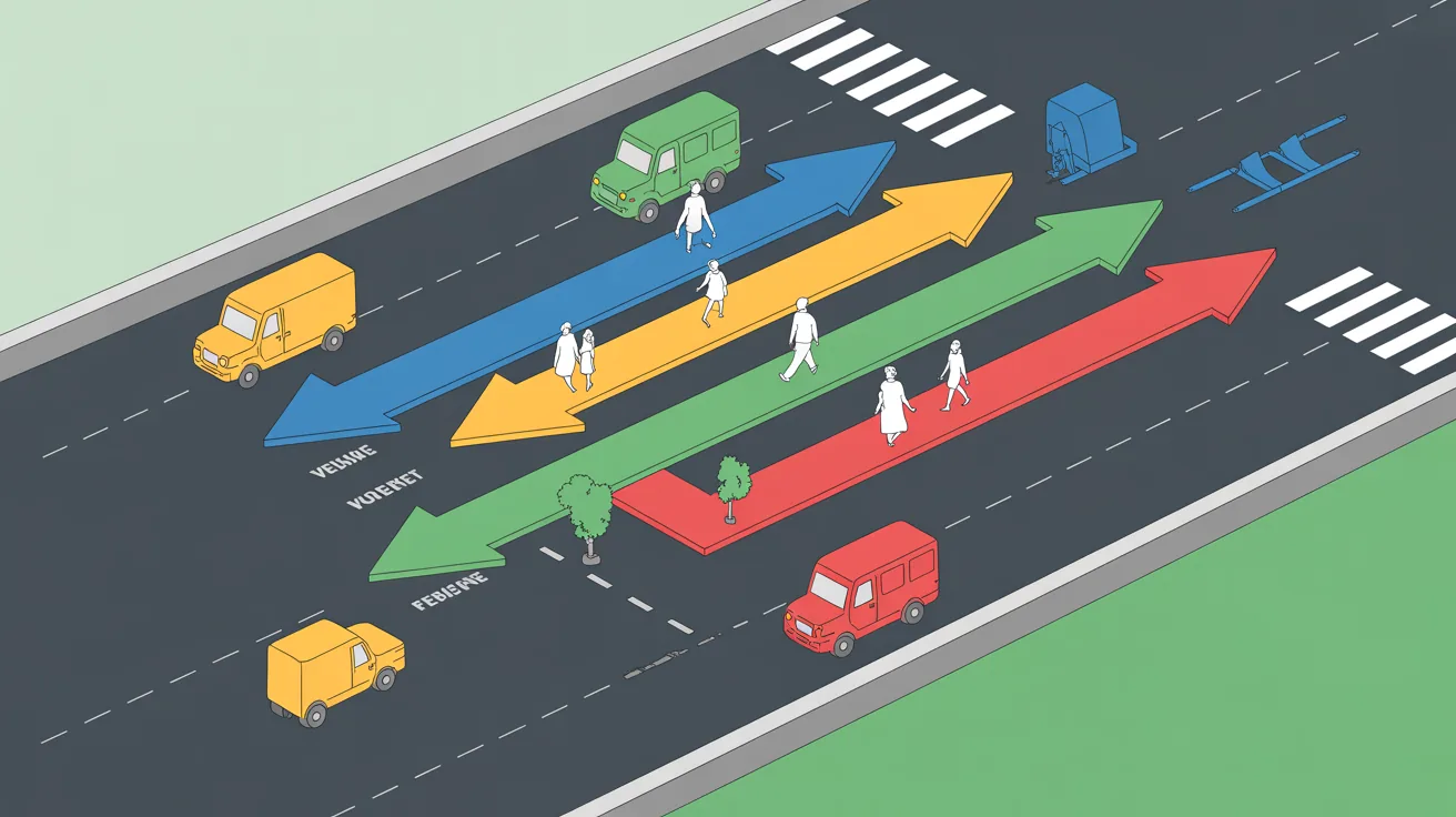
Access and movement covers vehicle approach, pedestrian routes, service access and where people actually arrive from. Desire lines matter more than official routes.
Views in both directions. What the site can see and what can see the site, since overlooking constrains a design as much as a good outlook enables one.
Topography and levels, which decide cut and fill, drainage and where a building can sit economically.
Context covering scale, materials, building lines and the character the proposal has to respond to.
Environmental factors including prevailing wind, noise sources, flood risk and existing vegetation.
💡 Pro Tip
Visit at two different times of day and write down what surprised you. Analysis assembled entirely from maps and data misses the things that decide a design, which are usually noise, smell, how the light actually falls and where people naturally walk. Half a day on site produces better diagrams than a week of desk research.
One Site Analysis Diagram Per Factor
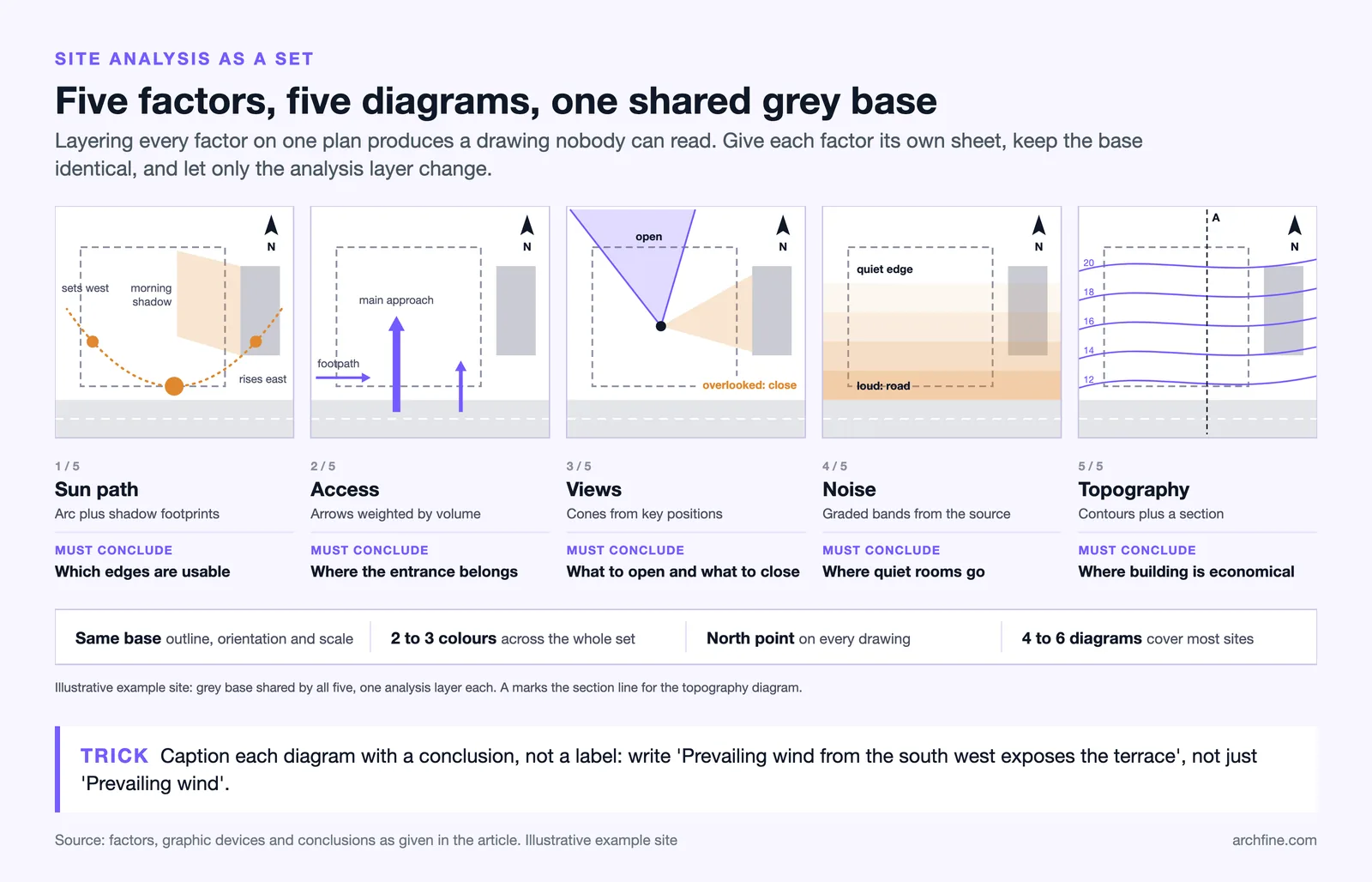
The discipline that makes a set work is separating the factors. Sun on one drawing, access on another, views on a third.
Each drawing then has one job and can be read in three seconds, which is all the attention any single diagram in a set receives.
Keep the base identical across all of them. The same site outline, the same orientation, the same scale, drawn in light grey, with only the analysis layer changing. A set that shares a base reads as one investigation.
Four to six diagrams covers most sites. More than that and the reader stops distinguishing them, which is the same limit that applies to any set as our guide to architectural diagrams covers.
From Analysis to Concept
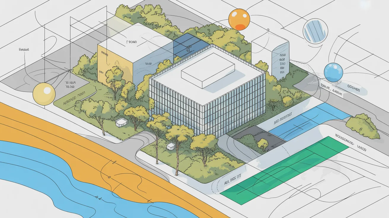
The step that separates useful analysis from decorative analysis is the synthesis drawing. After the individual factors, one diagram shows what they collectively imply.
That drawing typically identifies where the building should sit, which orientation the main spaces should take, where the entrance belongs and which edges need protecting. It is the first design decision and it should be traceable back to the analysis.
If the synthesis drawing could have been drawn without the analysis, the analysis was not doing any work. That is the honest test, and most student sets fail it.
The concept diagram that follows usually starts from this synthesis, as covered in our guide to bubble diagrams where programme meets site.
Recording each factor
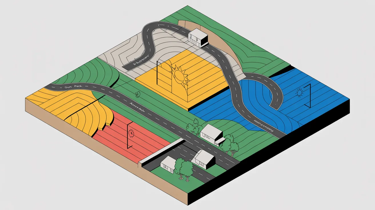
| Factor | Graphic device | What it should conclude |
|---|---|---|
| Sun path | Arc plus shadow footprints | Which edges are usable |
| Access | Arrows weighted by volume | Where the entrance belongs |
| Views | Cones from key positions | What to open and what to close |
| Noise | Graded bands from the source | Where quiet rooms go |
| Topography | Contours plus a section | Where building is economical |
Where the Data Comes From
The analysis feeds directly into the massing and orientation decisions covered in our guide to bubble diagrams, and the shadow testing behind it is covered in our guide to sun studies. Sun path data is freely available for any latitude, and the underlying solar geometry is well documented, and most modelling software will generate accurate shadows once the location and orientation are set, which is more reliable than a drawn arc.
Topographic surveys come from a surveyor and are worth commissioning properly on any site with a slope. Guessing levels is the most expensive shortcut in this process.
Planning history, constraints and designations come from the local authority and frequently change what is possible more than any physical factor does.
Environmental data including flood risk, air quality and noise mapping is published by government agencies in most countries, and organisations such as the US Green Building Council and the International Energy Agency publish the frameworks that turn that data into design targets.
Graphic Standards
Published competition sets on ArchDaily show the convention in use. Keep the palette to two or three colours across the whole set, used consistently. If red means constraint in one drawing it cannot mean circulation in the next.
Grey everything that is not the subject. Site outline, buildings and roads should sit back so the analysis layer reads immediately.
Use a north point on every drawing. Orientation is the one piece of information every site diagram depends on, and its absence forces the reader to keep referring back.
Caption each diagram with a conclusion rather than a label. Prevailing wind from the south west says nothing. Prevailing wind from the south west exposes the terrace says something.
Working With Consultants
Some of this analysis belongs to other people. Flood risk, ground conditions, ecology and transport all have specialist consultants whose reports arrive as documents rather than as diagrams.
Translating those reports into the site diagram set is worth doing, because a constraint buried in a fifty page appendix influences nothing. A single diagram showing the flood extent changes the design conversation immediately.
Credit the source on the drawing. Analysis derived from a consultant report should say so, both for accuracy and because it tells a reviewer the information is authoritative rather than assumed.
When to commission what
Topographic survey comes first on any sloping site, because nothing about levels can be resolved without it. Ground investigation follows once a footprint is likely. Ecology surveys are seasonal and need booking months ahead, which catches out projects that leave them late.
The professional work stages published by bodies such as RIBA set out the conventional sequence, and the practical version is simply to commission anything with a lead time before you need it.
Common Failures
Analysis with no conclusion is the first and most common. A set of beautifully drawn diagrams that leads to no design decision has documented a site rather than analysed it.
Everything on one drawing is the second. Sun, wind, views, access and noise layered together produces a drawing that is genuinely unreadable.
Generic content is the third. Diagrams that would apply to any site, showing a sun arc and a north arrow and nothing site specific, are filler.
Data without relevance is the fourth. Recording annual rainfall on a project where it changes nothing adds pages and removes credibility. If a factor does not affect a decision, leave it out.
Bottom Line: Site analysis earns its place when the synthesis drawing could not have been drawn without it. One factor per diagram, a shared base, and a conclusion in every caption will do more than any amount of graphic effort.
Analysis for Different Project Scales
A domestic extension needs three diagrams and half a day. Sun, access and overlooking cover almost everything that will shape the design, and anything more is padding.
A single building on a constrained urban site needs the full set, since context, rights of light and access all carry planning weight.
A masterplan needs analysis at two scales. The wider context establishes movement, character and connection, and the site scale establishes topography, drainage and existing features.
Matching the depth of analysis to the scale of the decision is the judgement that separates useful work from box ticking.
Keeping it current
Sites change during a project. A neighbouring consent granted after your analysis was drawn changes the overshadowing picture and the view analysis, and nobody revisits the diagrams unless it is someone’s job.
Check planning registers at each stage rather than once at the start. It takes minutes and it catches the change that would otherwise surface at committee.